From Break Time to Brain Time:
TU Library thesis collection wall redesign
Intro
Collection Wall is a thesis collection in the TU Delft Library. This physical interactive wall visualizes both the physical and digital collections in the TU repository.
Students studying at the TU Delft Library are not engaging with the collection wall. They are not feeling triggered or invited to interact with the wall, leading to unmet expectations.
The project is a concept design of the current digital thesis collections that aim to engage visitors through the library collections.
Client
Time
Feb - June 2024 (16 weeks)
Team
2 UX designer, 2 UX researcher
My role
User research, Ideation, concepts evaluation, user tests, all interface visual design

Overview
The problem
Students studying at the TU Delft Library are not engaging with the Collection Wall.
They are not feeling triggered or invited to interact with the Wall leading to unmet expectations.

The goal
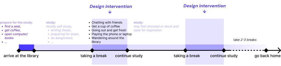
To make students feel motivated to explore the Collection Wall by triggering
their curiosity when they are on a study break.
Interaction in a break interval is intended to offer a mental diversion, allowing the user to draw inspiration from the other knowledge sources.
The solution
Attracting & Inviting students with tangible interactions and animations on the screen
We introduced an interactive world of theses, a joystick and light-hearted memes to make student study breaks more explorative. This design will replace 9 original screen and placed at the similar place in the library.

The impact
The new design significantly improves on playfulness and interaction,
while still remaining the product’s functionalities.
SUS score increased by 40%
The results were based on the SUS scores (iterated) of 10 students using original walls and our new-designed walls.
90% positive feedback for first-time use
Most of the user didn't use the wall before, they express positive emotions for using the product for the first-time. *(Based on preMo)*
Research
Positioning
Where is the wall?
The Collection Wall is a thesis collection in the TU Delft Library. It is placed on the side of the ground floor away from the entrance, in the right corner of the large wall displaying books.


Build-up
How is it constructed?
The Collection Wall consists of 3 main parts: the paper’s tokens, the showcase bookshelves and the interaction screen. In the design scope, we chose to focus on the interactive screen part.
Usability Assessment
Empathising and diving into the current experience
In order to address and figure out the questions, we decided to look at the bigger picture of this product: how the user, stakeholder, and product relate to each other? While we also zoomed in to assess the product usability: What are the current usability problems?
User survey
We got 53 valid answers from people who have ever visited the TU library. They are from different faculties.
40.4% Master students
55.8% Bachelor students
3.8% Others (vistors)

Click to see the survey results
Usability assessment
We conducted an usability test with 10 people, both in groups and individually. The goal is to get first impressions from students from different faculties and see where users struggle with the interaction and where it does something different than they expect. The user journey map is created after that.

Click to see the journey map
Problems findings when experiencing the product

💡 Take away
During the field research, we found there were only a few people who have ever used the product. Some of them even never noticed there’s an interactive screen there. One significant reason is the location of the current product. However, even though they saw the product, they still would not like to interact with it
Why people don’t use it?
Does it cater to the needs of students who study in the library?
Analysis
Problem clusters
Problems arising between the product and user in direct and indirect interaction
Problem in direct interaction: problems arise when the user is interacting with the product up closel;
Problems in extended interaction: problems concerning the interaction with the product from afar;
Problems about the goal of the product and it misaligning with the user needs.

User analysis
Students are more likely to have a focussed mind in exam season, and have more of a free mind in weekends or at the start of a new semester
It was also found that the free minded phase is the best implement our intervention, since they have around 5-10 minutes to dedicate to something fun and exciting!

💡
During their study breaks, they prefer to engage in relaxing or non-serious activities. This led our design direction to a non-academic focus solution.
Ideation
The brainstorming process
Started with individual ideation as seen in the figure below, jotting down all ideas that aligned with the design goals. As we gathered for brainstorming sessions, the next step was to categorise and merge these individual ideas into cohesive clusters.

Test & chose the concepts
We developed 3 concepts and tested them with the simple prototypes to validate which direction to go next, and evaluated it with the Harris profile to select the final concept.

The overview product evolution

Evaluation
The new design turnout to be appealing in visuals and thesis content.
It offers simple interaction in a limited study break.
The user test was divided into 2 different tasks: one was testing in the real context to see whether people would use the prototype; another one was in the studio, where we can easily control the prototype and ask further questions after the test.
Test tasks

Test process & results


Final design
How to interact with it?
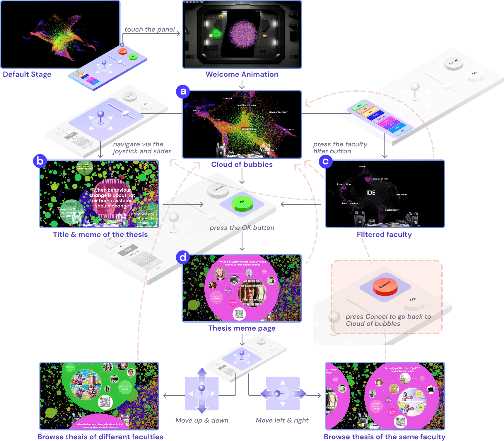
After a final round of iteration, the final design was ready to launch! The design is an interactive world of theses, a joystick and lighthearted memes to make student study breaks more explorative.
Step 1. to approach

Digital screen
Step 2. to interact

Physical control panel
Step 3. to explore

Thesis details & meme
Quick look at the video :)
Transition Animation

Faculty filters

Zoom in interfaces for thesis

Swipe to other thesis

Interaction flow
Reflection
Impact: This project transformed the often daunting first step of starting a research project into a more engaging experience. By turning the process into a lighthearted, gamified activity, we created a tool that not only makes breaks more enjoyable but also stimulates creativity and sparks fresh inspiration for students!
What I learned: This project taught me that design is as much about collaboration as it is about creativity. Our team faced conflicts that slowed down decision-making and timelines. Instead of letting these challenges derail us, we openly addressed the issues and introduced a simple voting system to ensure that everyone’s voice was heard. This experience helped me understand how constructive communication and structured decision-making can transform conflict into progress.